
A map can tell a story without saying a word. Sometimes, the fewer elements it contains, the more clearly that story comes through.
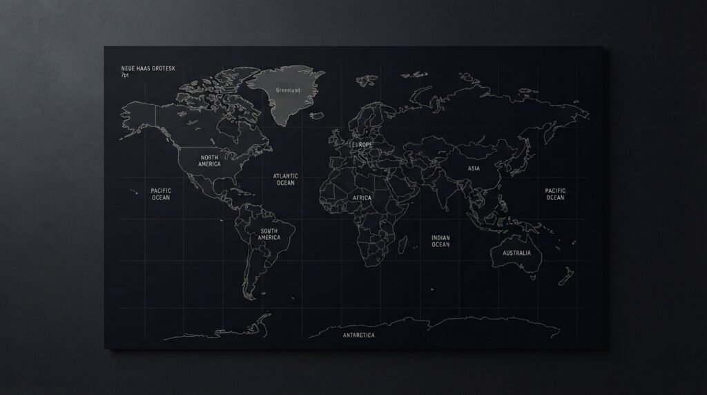
Maps have always been more than practical tools for finding our way. They can record journeys, represent places we love, remind us of where we have been or simply allow us to look at the world from a different perspective.
But when a map becomes a visual object rather than a navigation tool, something changes.
It no longer needs to show everything.
It needs to show what matters.
What is a minimalist map?
A minimalist map is a simplified representation of a place, created by reducing visual elements while preserving its essential identity.
Roads, borders, coastlines, rivers, neighborhoods and landmarks can all be represented with simple lines, shapes and carefully selected details. The goal isn’t to remove information randomly. It is to make deliberate decisions about what stays and what goes.
This is where minimalism becomes more than an aesthetic.
It becomes a way of communicating.
A traditional map may need to answer many questions at once: Where am I? Which road should I take? What is nearby? How do I get there?
A minimalist map asks a different question:
What makes this place recognizable and meaningful?
That distinction changes the entire design.
When less becomes more
One of the most interesting things about minimalist design is that simplicity doesn’t necessarily mean less work.
Quite the opposite.
When there are fewer elements on a page, every element becomes more important. A line that is slightly too thick can change the balance. A label in the wrong position can distract from the composition. Too many details can make the map feel crowded; too few can make it lose its identity.
The designer has to find the point between information and simplicity.
Think about a familiar city.
You may recognize it from the shape of its coastline, the position of a river, the arrangement of a few major roads or even a handful of landmarks. You don’t need every street to know where you are.
The same principle applies to minimalist maps.
Recognition often comes from a few carefully chosen details, not from showing everything.
Maps as pieces of visual memory
There is another reason maps work so well as decorative pieces: they can carry personal meaning.
A map can represent the city where someone was born, the place where they met someone special, a favorite travel destination or simply somewhere they have always wanted to visit.
In that sense, a map can become a kind of visual memory.
It doesn’t have to explain the entire story.
A single point on a map can be enough to bring one back to a particular moment.
That is one of the things we find fascinating about maps at AlejoAyaM. They sit somewhere between information and emotion. They are geographical, but they can also be deeply personal.
Designing with restraint
Minimalist design requires restraint.
There is always the temptation to add one more road, another label, another color or another detail because the information is available.
But having information doesn’t mean we need to display it all.
Good visual design often begins with a simple question:
Does this element help the viewer understand or appreciate the piece?
If the answer is no, perhaps it doesn’t need to be there.
This doesn’t mean every minimalist map has to look extremely simple or use only one color. Minimalism isn’t a fixed visual formula. It can be monochromatic, typographic, geometric, subtle or even expressive.
What matters is the relationship between the elements.
Nothing should be there by accident.
From map to object
When a map is designed for a wall, a desk or a printed page, its purpose changes again.
It needs to work from a distance and up close. It needs enough visual structure to catch attention without becoming tiring to look at. Typography, spacing, proportions and composition become just as important as geographical accuracy.
At that point, the map becomes something more than a representation of a place.
It becomes an object.
Something that can live in a home, an office or a personal collection while quietly telling the story of somewhere in the world.
And perhaps that is the real beauty of minimalist maps.
They don’t try to tell you everything.
They leave just enough for you to look closer.